
HTML, CSS, and JavaScript: The Building Blocks
Exploring the Wonders of the Web.


The web is an overwhemlingly huge landscape—which keeps on growing by the minute. It’s not practical to imagine that you have explored even a fraction of it. It’s grown to be a place where we connect, explore, learn, create and share. But behind this vibrant tapestry of sites, apps, and services lies a trio of technologies that make it all possible: HTML, CSS, and JavaScript. These three languages—which are quite popular and I reckon are not alien terms—form the foundational building blocks of the web, each with a unique role that contributes to the seamless experience we have during our browing endeavors.
In this post, we’ll break down the purpose of these core technologies, their impact on the web, and how they’ve shaped our online experiences. You don’t need to be a web developer nor programmer to appreciate their importance; understanding how they work helps you see the web through a different lens and have a much more profound insight about it.
HTML: The Web’s Blueprint
At its core, HTML—which stands for HyperText Markup Language—is the web's foundational structure, acting as the blueprint for every webpage. Just as an architect drafts the framework of a building, HTML lays out the essential structure of a website, determining how content is organized and presented so that web browsers can interpret and display it effectively.
HTML doesn't dictate the final appearance of a webpage—much like a blueprint doesn’t specify the interior design—but it establishes the underlying structure, ensuring everything is in its proper place. HTML uses a system of tags (or elements) to define and organize content such as text, images, videos, and links. These tags instruct the browser on how to render each piece of content.
Without HTML, a webpage would be nothing more than a blob of unformatted data or, worse yet, wouldn't exist at all—similar to a house without its skeletal framework. For instance, a simple HTML document could include a headline (<h1>), a paragraph of text (<p>), and an image (<img>), all nested within a logical structure that gives the page its basic form and purpose.
Here’s an example of how HTML might structure these elements:
<!DOCTYPE html>
<html lang="en">
  <head>
    <meta charset="UTF-8">
    <meta name="viewport" content="width=device-width, initial-scale=1.0">
    <title>Sample Page</title>
  </head>
  <body>
    <h1>This is a Heading</h1>
    <p>This is a paragraph of text that provides some content for the webpage.</p>
    <img src="example.jpg" alt="An example image">
  </body>
</html>

In this case, each element plays a crucial role:
The
<h1>defines the main heading, making it stand out as the page’s title.The
<p>organizes the text into a readable paragraph.The
<img>element embeds an image onto the page.
HTML’s true power lies in its ability to create a structured, accessible, and readable web experience. Without it, navigating the internet would be like reading a jumbled, unorganized book with no chapters, headings, or clear flow—a frustrating and chaotic experience.
Semantic HTML: More Than Just Structure
HTML has evolved from simply laying out content to offering semantic meaning. Semantic HTML introduces elements that not only describe content visually but also provide contextual meaning. For instance:
<article>defines a block of content that could stand alone (like a news article).<nav>represents a navigation menu.<footer>marks the bottom section of a webpage.
This semantic structure is important not only for web browsers but also for search engines and accessibility tools. By using the correct HTML elements, web developers make their sites easier to navigate for visually impaired users (through screen readers) and help search engines index pages correctly. In short, semantic HTML improves both user experience and SEO (Search Engine Optimization).
From humble beginnings as a way to link research papers, HTML has evolved into a sophisticated language that forms the backbone of the modern web, ensuring that every webpage has a clear, organized framework upon which additional features, styles, and interactivity can be built.
How HTML Interacts with Other Web Technologies
HTML does not operate in isolation. It works closely with CSS and JavaScript to create the polished, functional websites we interact with today. While HTML defines what content exists on the page (the what), CSS defines how that content looks (the how), and JavaScript controls how it behaves (the action).
CSS: Styling the Web’s Canvas
If HTML is the web’s skeleton, then CSS—short for Cascading Style Sheets—is the skin, clothing, and décor that bring life to that structure. CSS is what makes websites visually appealing, transforming raw, unstyled content into engaging, beautifully designed pages. It manages everything from layouts and colors to fonts and animations, shaping the overall look and feel of a website. Without CSS, the web would still function, but it would be bland—purely functional but visually uninteresting.
CSS is a style sheet language that allows web developers to separate the visual design from the content itself (which is handled by HTML). This separation brings several advantages:
Consistency: A single CSS file can be applied to multiple pages, ensuring a unified visual identity across an entire website. This is how large websites maintain consistent styling without manually coding each page's appearance.
Flexibility: Developers can modify a site’s design without touching the underlying HTML. This means you can completely change the look of a website by swapping out or updating the CSS file—keeping the structure intact while altering the style.
Efficiency: CSS enhances website performance by allowing browsers to cache style sheets, reducing load times. Once a user’s browser has downloaded the CSS file, it can reuse it across the entire site, minimizing redundant data transfer.
CSS in Action: Layouts, Responsiveness, and Animations
One of CSS’s key strengths is its ability to control both simple and complex layouts. With powerful tools like Flexbox and Grid, developers can precisely determine where elements appear on the page, how they respond to various screen sizes, and how they interact with each other in terms of alignment and spacing.
Flexbox and Grid:
Flexbox: A one-dimensional layout model ideal for organizing content in a single row or column, especially when content needs to resize or adjust based on available space. Flexbox is great for managing layouts with simple, predictable content flow.
Grid: A two-dimensional system that excels at creating complex, multi-column layouts, offering more control over how content is distributed both horizontally and vertically. It allows designers to build intricate, responsive grid-based layouts with minimal code.
In today’s era of diverse devices, from smartphones to large desktop monitors, responsive design has become a critical aspect of web development. CSS plays a central role in responsive design through the use of media queries. Media queries enable developers to tailor a website’s layout based on the device’s screen size or orientation, ensuring that the site looks good and functions well on any device.
For instance, a website viewed on a mobile device may adopt a single-column layout, allowing for easy scrolling and readability. On a desktop, however, that same site could present a multi-column layout with sidebars, all without changing the underlying HTML. CSS dynamically adjusts the presentation based on the screen size.
Example of Responsive Design:
<!DOCTYPE html>
<html lang="en">
<head>
    <meta charset="UTF-8">
    <meta name="viewport" content="width=device-width, initial-scale=1.0">
    <title>Responsive Grid Example</title>
    <link rel="stylesheet" href="styles.css"> <!-- Link to the external CSS file -->
</head>
<body>
    <div class="container">
        <div class="item">Item 1</div>
        <div class="item">Item 2</div>
        <div class="item">Item 3</div>
        <div class="item">Item 4</div>
        <div class="item">Item 5</div>
        <div class="item">Item 6</div>
    </div>
</body>
</html>
/* Default for desktops */
.container {
display: grid;
grid-template-columns: repeat(3, 1fr);
gap: 20px;
}
/* For smaller screens, like tablets or phones */
@media (max-width: 768px) {
.container {
grid-template-columns: 1fr;
}
}
.item {
background-color: #3498db;
padding: 20px;
color: white;
text-align: center;
border-radius: 5px;
}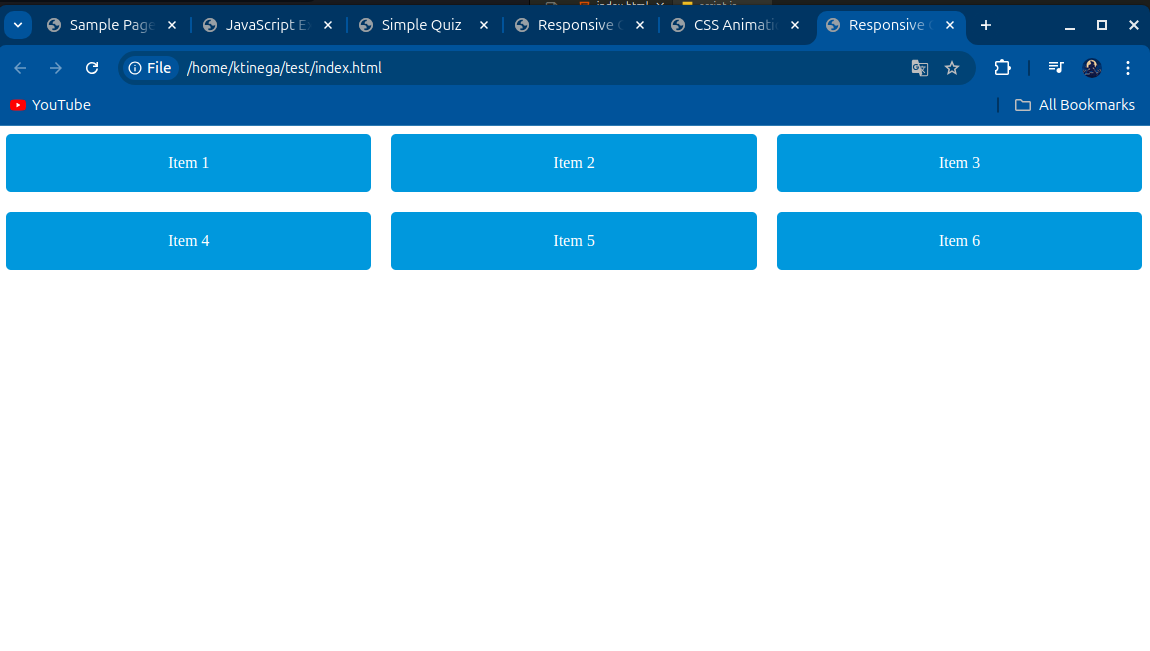
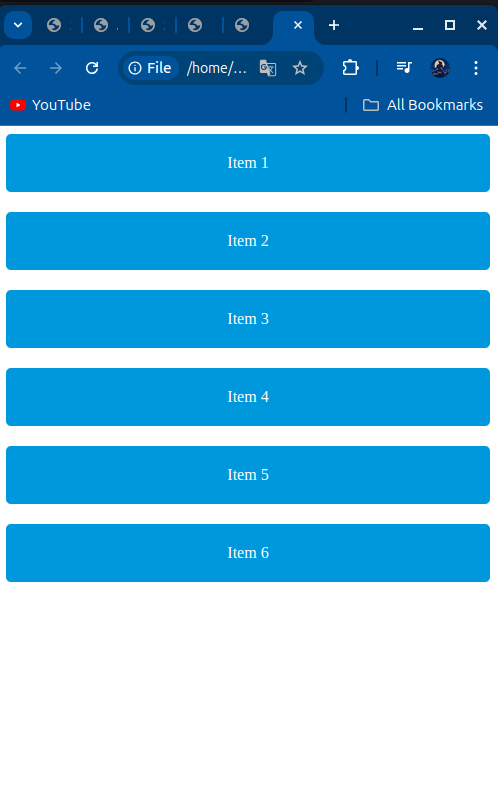
In this example, the Grid layout initially presents a three-column structure for desktop screens, but when viewed on smaller devices, the layout automatically shifts to a single-column format.
Animations and Interactivity with CSS
CSS isn't just about static designs—it also adds life to websites through animations. CSS allows developers to create transitions and animations that can enhance the user experience, drawing attention to important elements, such as buttons, notifications, or links, without overwhelming the user.
Transitions make it easy to add smooth effects when elements change from one state to another, such as when a button changes color on hover. More complex keyframe animations allow developers to control an element's appearance at multiple points during the animation, providing greater flexibility for creating engaging effects.
Example of a Simple CSS Animation:
<!DOCTYPE html>
<html lang="en">
<head>
    <meta charset="UTF-8">
    <meta name="viewport" content="width=device-width, initial-scale=1.0">
    <title>CSS Animation Example</title>
    <style>
        button {
            background-color: #3498db;
            color: white;
            padding: 15px;
            border: none;
            transition: background-color 0.3s;
        }

        button:hover {
            background-color: #2ecc71;
        }

        @keyframes bounce {
            0%, 100% { transform: translateY(0); }
            50% { transform: translateY(-20px); }
        }

        .bounce { animation: bounce 2s infinite; }
    </style>
</head>
<body>
    <button class="bounce">Hover Me!</button>
</body>
</html>
In this example, the button smoothly transitions between two background colors when hovered over. Additionally, the .bounce class applies a simple animation that makes an element bounce up and down repeatedly, adding a playful touch to the page.
CSS, with its ability to control layout, responsiveness, and animation, ensures that web pages are not only functional but also visually dynamic, engaging, and optimized for a wide range of devices. It transforms the web into an artful, interactive canvas, making it more enjoyable for users to explore and experience.
JavaScript: Bringing Web Pages to Life
If HTML forms the foundation of the web and CSS adds the aesthetic polish, JavaScript is the magic that brings websites to life. It transforms static pages into dynamic, interactive experiences, allowing users to interact with websites in real-time. JavaScript, a versatile and essential programming language, enables web pages to respond to user input, update content on the fly, and handle complex interactions without ever needing to reload the page.
JavaScript’s Role in Interactivity
Before JavaScript, websites were largely static; content was fixed, and any action—like submitting a form—would require a full page reload. This made web browsing slower and less user-friendly. JavaScript revolutionized the web by making it possible for websites to interact with users in real time. Today, JavaScript powers the interactivity that’s become essential to the modern web.
Here’s a glimpse of JavaScript’s real-world impact:
Form Validation: JavaScript can check if a user has entered a valid email or filled in all required fields before the form is submitted, preventing incomplete or erroneous submissions. Imagine filling out a form, pressing submit, and instantly seeing feedback without waiting for a new page to load.
Real-time Content Updates: Whether it’s updating a social media feed or refreshing a live sports score, JavaScript allows content to change dynamically without reloading the entire page. This is especially important for websites where up-to-the-second information is critical.
Dynamic Animations and Transitions: JavaScript enables complex animations and transitions that make web experiences more fluid and engaging. Interactive features like image carousels, expandable menus, and pop-up modals are all driven by JavaScript.
Asynchronous Data Handling (AJAX): JavaScript can send and retrieve data from a server in the background using AJAX (Asynchronous JavaScript and XML). This allows for real-time interactions—like loading new posts on a blog or updating product availability—without interrupting the user's experience.
JavaScript and the DOM: A Dynamic Partnership
JavaScript works hand-in-hand with the DOM (Document Object Model) to make web pages interactive. The DOM is a tree-like representation of a webpage's structure, created from the HTML. With JavaScript, developers can manipulate the DOM in real time, giving websites the ability to change their structure, content, and style dynamically.
For example, imagine you’re shopping online. When you add an item to your cart, JavaScript updates your cart count, calculates the total, and might even suggest related items—all without reloading the page. JavaScript can show or hide elements, change their appearance, or even create new elements from scratch, all by manipulating the DOM in real time.
Here’s how it works in practice:
Showing/Hiding Elements: JavaScript can make content appear or disappear, like toggling a dropdown menu or displaying a pop-up alert.
Updating Styles Dynamically: It can also change the look of elements on the fly, like highlighting a product when it’s added to your cart.
Adding New Content: JavaScript can dynamically add new content, such as loading more items when you scroll down a page—something that’s common in infinite scrolling designs on social media and news websites.
Example of JavaScript in Action
Let’s look at a simple example that showcases how JavaScript can add interactivity to a webpage. In this example, a button is clicked, and a hidden message appears, all made possible by JavaScript:
<!DOCTYPE html>
<html lang="en">
<head>
  <meta charset="UTF-8">
  <meta name="viewport" content="width=device-width, initial-scale=1.0">
  <title>JavaScript Example</title>
</head>
<body>
  <h1>JavaScript Interaction Example</h1>
  <button id="myButton">Click Me!</button>
  <p id="message" style="display: none;">Hello! You just clicked the button!</p>

  <script src="script.js"></script>
</body>
</html>
The JavaScript code behind this interaction looks like this:
// Get the button and paragraph elements from the HTML
const button = document.getElementById('myButton');
const message = document.getElementById('message');

// Add an event listener to the button for the 'click' event
button.addEventListener('click', function() {
  // When the button is clicked, show the message
  message.style.display = 'block';
});
In this example:
When the user clicks the button, the hidden message "Hello! You just clicked the button!" appears, showcasing how JavaScript can dynamically change a webpage's content based on user interactions.
The Evolution of JavaScript
JavaScript has come a long way since its early days as a simple tool to make web pages interactive. Initially, it was limited to small tasks within the browser, but now it has grown into a robust, full-fledged programming language that’s used both on the front end (in the browser) and the back end (on servers).
With the rise of platforms like Node.js, JavaScript has moved beyond the browser, powering everything from web servers to API gateways. It can now be used to build entire applications, from the user interface to the server-side logic.
In addition to Node.js, modern JavaScript frameworks such as React, Vue.js, and Angular have dramatically expanded what developers can accomplish with the language. These frameworks allow developers to build sophisticated single-page applications (SPAs), which offer a seamless, app-like experience within the browser. These applications rival desktop software in terms of performance and functionality, offering rich user interfaces, smooth transitions, and real-time data interaction.
JavaScript's Role in the Modern Web: PWAs, Serverless, and Beyond
JavaScript is also the backbone of Progressive Web Apps (PWAs), which are websites that function like native apps. PWAs can work offline, send push notifications, and provide a more immersive experience, all while running in the browser. This is all made possible by Service Workers, a JavaScript feature that caches resources and handles background tasks, allowing users to access content even without an internet connection.
In the world of serverless computing, JavaScript enables developers to build backend functionality without managing traditional servers. Using services like AWS Lambda, JavaScript can run lightweight, scalable functions in response to events (such as a user making a purchase or submitting a form), improving efficiency and reducing costs.
JavaScript: The Future of the Web
JavaScript continues to push the boundaries of what’s possible on the web. From its humble beginnings to becoming a universal programming language, it now powers everything from simple interactive forms to full-blown applications that run in the browser or on the server. It has evolved to meet the needs of a growing, complex web ecosystem, and its future looks even brighter as developers find new ways to harness its power for creating interactive, responsive, and dynamic user experiences.
In short, JavaScript is what makes the web alive, turning static HTML and styled CSS into a fully interactive and immersive experience that responds to users in real-time. Without JavaScript, the internet as we know it today simply wouldn’t exist.
The Synergy of HTML, CSS, and JavaScript
The true magic of the web comes to life when HTML, CSS, and JavaScript work together in harmony. While each technology plays a distinct role, their combined efforts result in the engaging, interactive web experiences we’ve come to expect. Individually, they contribute structure, style, and interactivity—but together, they create the fluid, dynamic websites that shape our digital world.
Breaking It Down: The Role of Each Technology
Let’s break it down with an example: Imagine an online quiz—a common feature on many websites.
HTML (Structure): HTML forms the backbone of the quiz. It defines the quiz’s structure, including the questions, answer buttons, and how these elements are laid out on the page. It provides the raw content, like question text and input fields for the user.
CSS (Style): CSS enhances the visual appeal, transforming the bare-bones structure into something attractive. It adjusts colors, adds spacing between questions, makes buttons more clickable, and sets up responsive design so the quiz looks good on both mobile and desktop screens.
JavaScript (Interactivity): JavaScript brings the quiz to life. When the user selects an answer, JavaScript handles the logic to check if the answer is correct, updates the score in real time, and loads the next question. It tracks the user’s progress and can provide feedback or results dynamically.
Example of Their Synergy in Action
Let’s look at a simple example that showcases how HTML, CSS, and JavaScript work together in an interactive quiz:
<!DOCTYPE html>
<html lang="en">
<head>
  <meta charset="UTF-8">
  <meta name="viewport" content="width=device-width, initial-scale=1.0">
  <title>Simple Quiz</title>

  <!-- CSS: Styling the Quiz -->
  <style>
    body { font-family: Arial, sans-serif; background-color: #f4f4f4; }
    .quiz-container { max-width: 600px; margin: 0 auto; padding: 20px; background: #fff; box-shadow: 0 0 10px rgba(0, 0, 0, 0.1); }
    h2 { color: #333; }
    .question { margin-bottom: 10px; }
    .answer { display: block; margin-bottom: 5px; background: #007bff; color: white; padding: 10px; text-align: center; cursor: pointer; border-radius: 5px; }
    .answer:hover { background: #0056b3; }
    .hidden { display: none; }
  </style>
</head>
<body>

  <!-- HTML: Structure of the Quiz -->
  <div class="quiz-container">
    <h2>Simple Quiz</h2>
    <p id="question">What is the capital of France?</p>
    <div class="answer" data-correct="false">Berlin</div>
    <div class="answer" data-correct="false">Madrid</div>
    <div class="answer" data-correct="true">Paris</div>
    <div class="answer" data-correct="false">Rome</div>
    <p id="feedback" class="hidden">Correct!</p>
  </div>

  <!-- JavaScript: Interactivity -->
  <script>
    const answers = document.querySelectorAll('.answer');
    const feedback = document.getElementById('feedback');

    answers.forEach(answer => {
      answer.addEventListener('click', function() {
        if (this.dataset.correct === "true") {
          feedback.textContent = "Correct!";
        } else {
          feedback.textContent = "Wrong answer, try again!";
        }
        feedback.classList.remove('hidden');
      });
    });
  </script>
</body>
</html>
In this example:
HTML provides the structure of the quiz. The quiz has a question and multiple answer choices defined using standard HTML elements such as
divandp.CSS adds the visual styling to make the quiz visually appealing. It styles the buttons, colors them, and adds hover effects, making it engaging and user-friendly.
JavaScript introduces interactivity. When a user clicks on an answer, JavaScript checks if the answer is correct by accessing the
data-correctattribute of the answer. It then displays feedback ("Correct!" or "Wrong answer, try again!") without refreshing the page.
The Power of Working Together
Individually, HTML creates the foundation, CSS adds aesthetic appeal, and JavaScript brings interactivity. But when combined, they form the backbone of modern web development, transforming what could be a static page into an interactive, dynamic experience.
Without this synergy, web pages would remain simple, static documents. With it, the modern web becomes a living, breathing platform, full of engaging, responsive, and visually appealing experiences. Whether you’re taking an online quiz, checking the weather, or booking a flight, these three building blocks work together seamlessly to provide the experience you see on screen.
Why Understanding These Core Technologies Matters
You might wonder, “Why should I care about HTML, CSS, and JavaScript if I’m not a developer?” The answer is simple: these building blocks shape your entire experience on the web. By understanding them, even at a high level, you gain insight into how websites function, why they behave a certain way, and what it takes to create the online experiences we often take for granted.
Whether you’re a casual web user or someone thinking of building an online presence, knowing the fundamentals of how the web is built empowers you. You’ll be able to appreciate not just the design of a website, but also the thought and functionality behind it.
Conclusion: The Foundation of the Web, Today and Tomorrow
As we continue our journey through the digital world, it’s clear that HTML, CSS, and JavaScript are not just languages—they are the foundation of the web as we know it. They’ve helped the web evolve from simple text documents to the immersive, interactive experiences we use every day.
As the web continues to grow, so will the capabilities of these core technologies. Whether it’s through advances in responsive design, web application frameworks, or new standards, HTML, CSS, and JavaScript will remain the building blocks upon which the web of the future is constructed.
Learning Resources
Books
"HTML and CSS: Design and Build Websites" by Jon Duckett
An excellent beginner-friendly book that explains HTML and CSS fundamentals with clear visuals and engaging content.
Courses
FreeCodeCamp's "Responsive Web Design"
A comprehensive, free course that teaches responsive web design using HTML and CSS, complete with practical projects to reinforce learning.FreeCodeCamp's "JavaScript Algorithms and Data Structures"
This course covers the basics of JavaScript, focusing on algorithms and data structures, enhancing problem-solving skills through hands-on coding exercises.
Tools
Code Editors (e.g., VSCode)
A powerful code editor that supports multiple languages, featuring IntelliSense, debugging tools, and extensions to improve your coding experience.Browser Developer Tools
Built into modern browsers, these tools allow you to inspect, modify, and debug HTML and CSS in real-time, making it easier to refine your web pages.
Additional Resources
MDN Web Docs: Comprehensive documentation for web technologies.
Codecademy: Interactive courses on HTML, CSS, and JavaScript.
YouTube Channels:
Traversy Media: Tutorials on various web development topics.
The Net Ninja: Project-based web development tutorials.
Stay tuned for our next deep dive, where we explore Modern Web Development Tools and how these technologies have evolved over time and what the future holds for the web!